How to read a Mollier h-x chart — and a blank sheet to download
Six blank h-x sheets in vector PDF and SVG, plus the part a blank sheet cannot tell you: which line is which, and how to get a number off the paper.
Download the Mollier h-x sheets
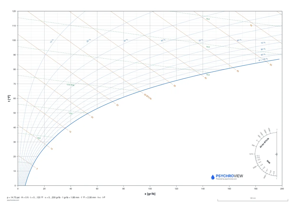
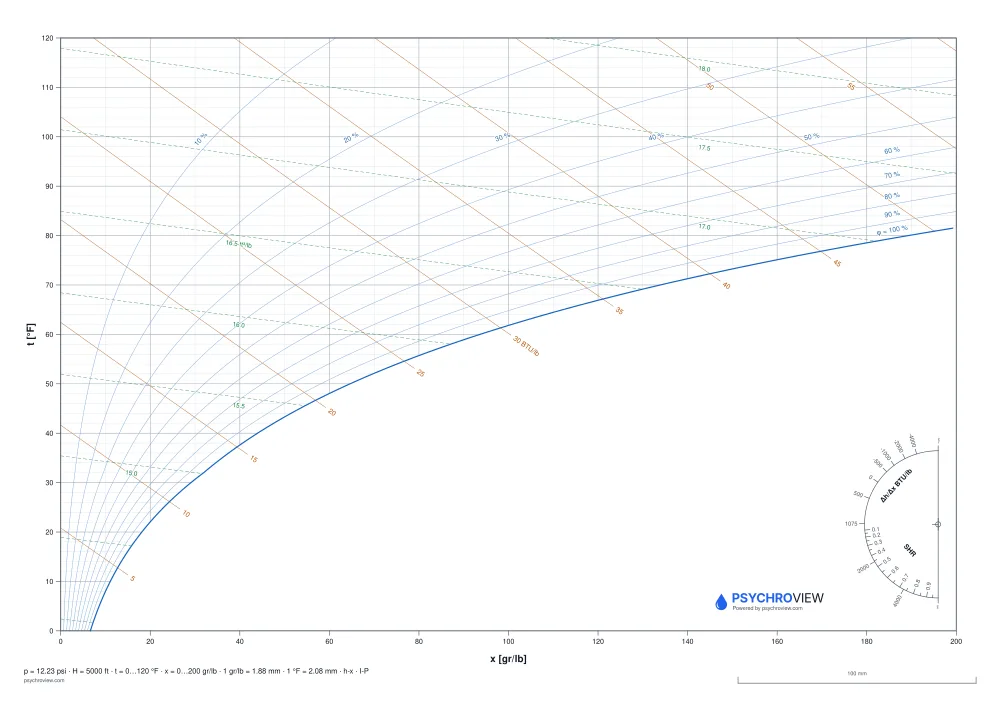
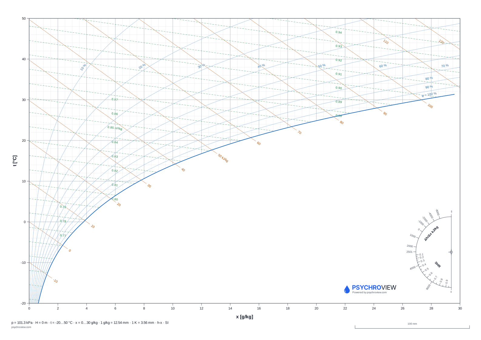
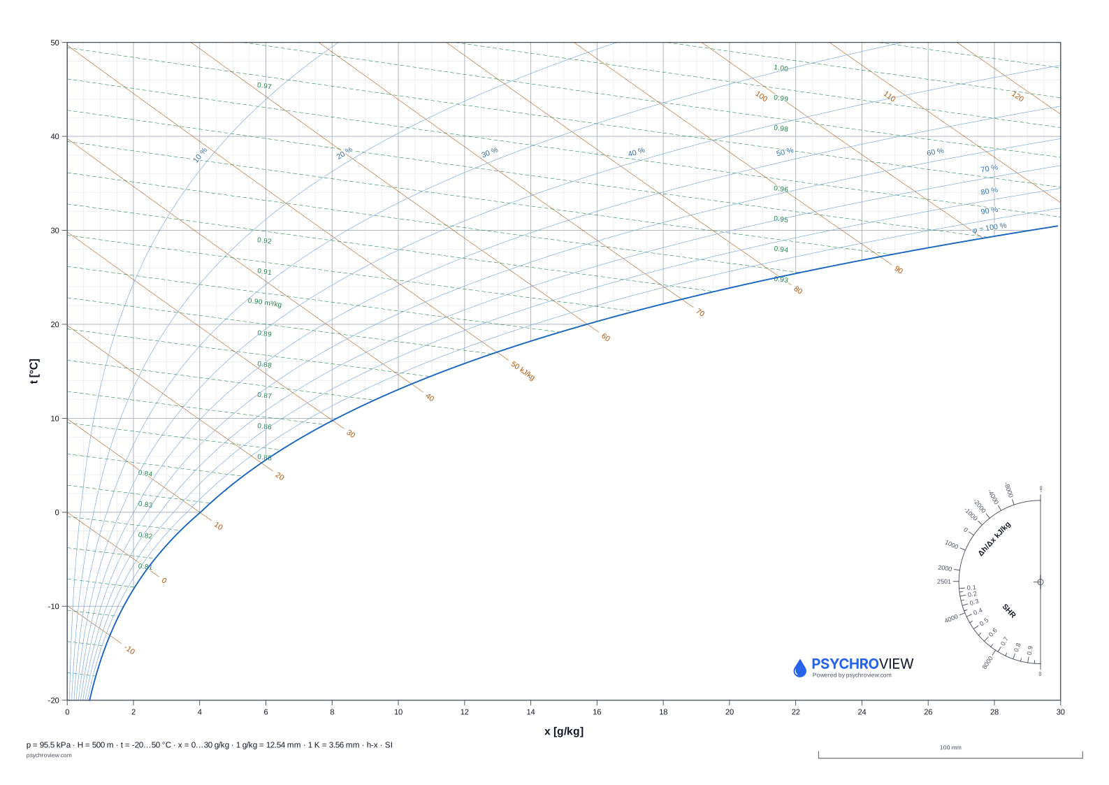
Vector PDF in A4 and A3, SVG in A3. SI and I-P, sea level, 500 m, 1 000 m and 5 000 ft, plus a black-and-white variant for photocopiers.
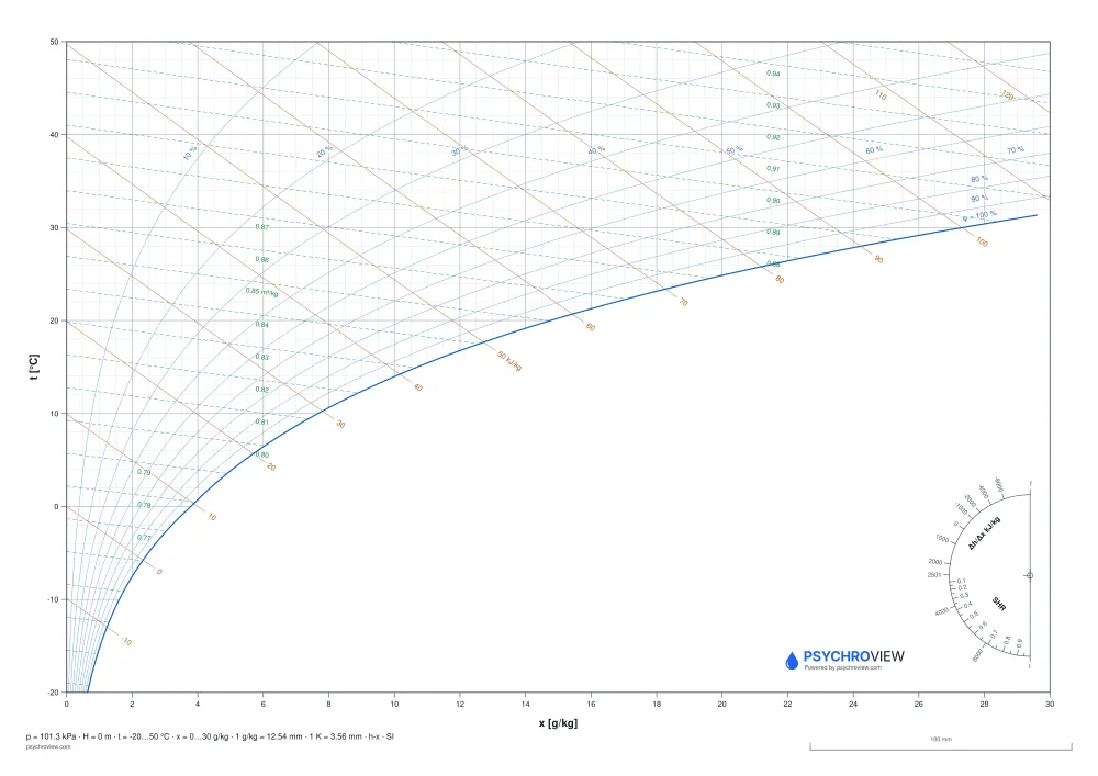
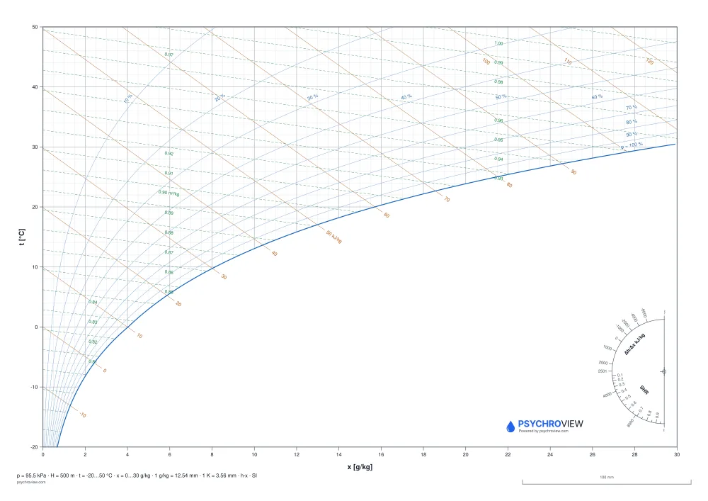
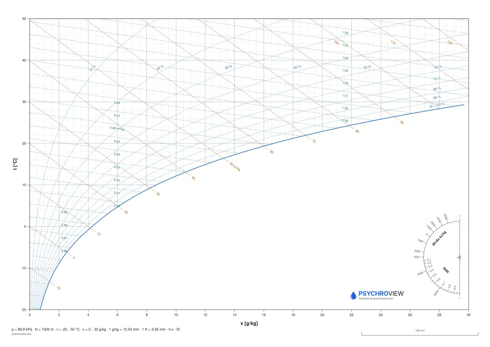
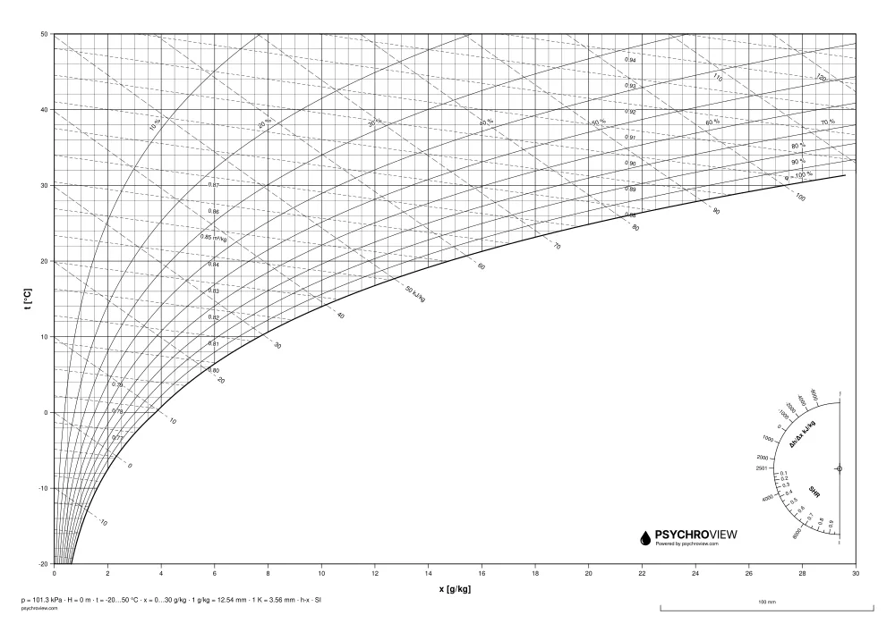
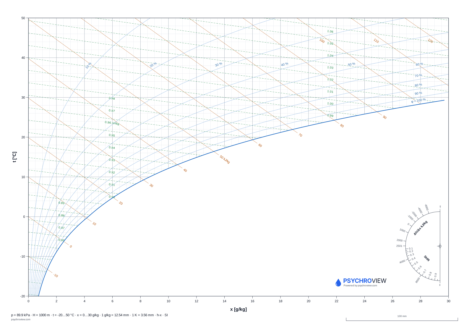
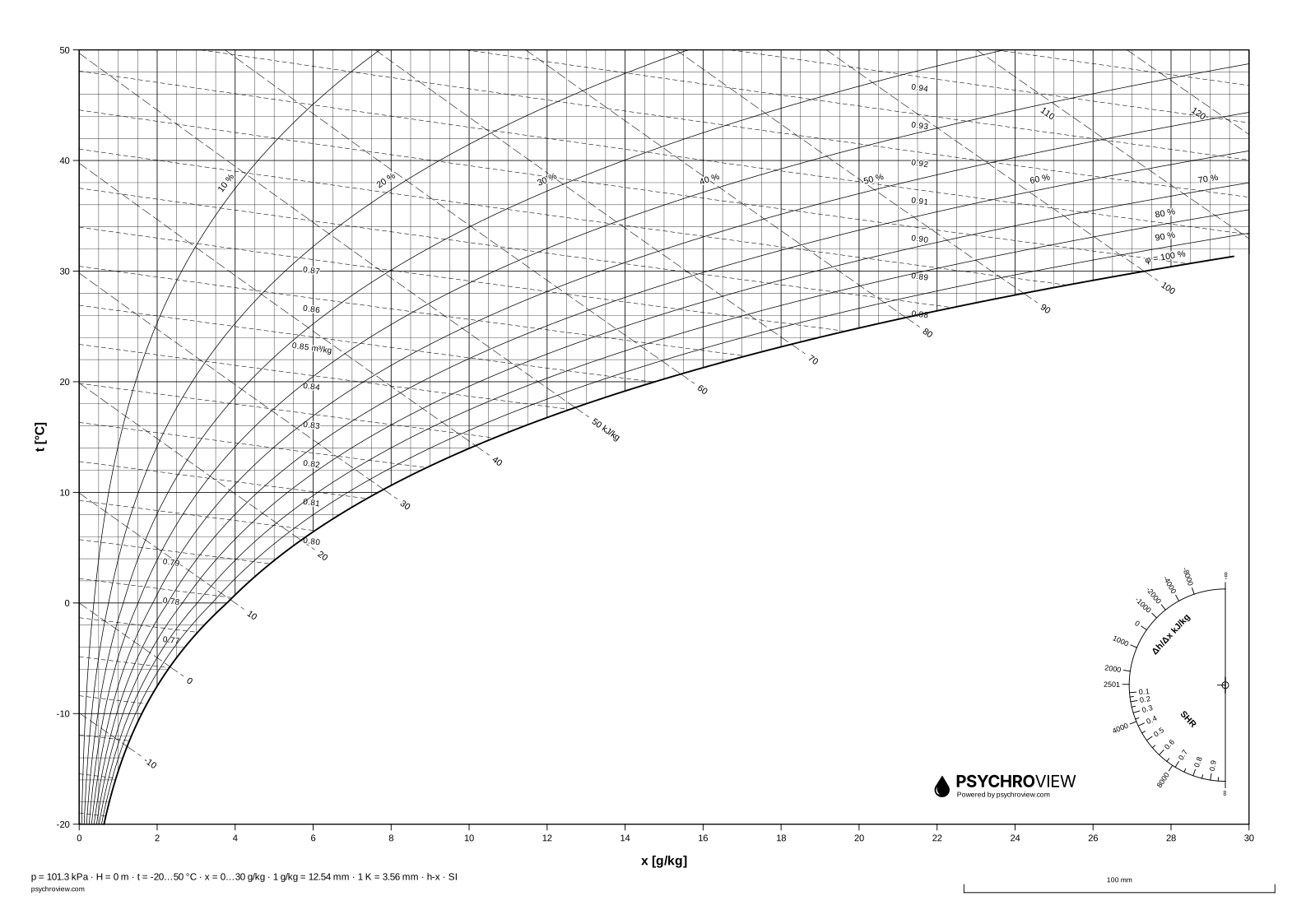
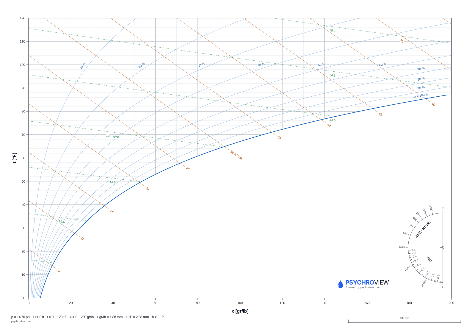
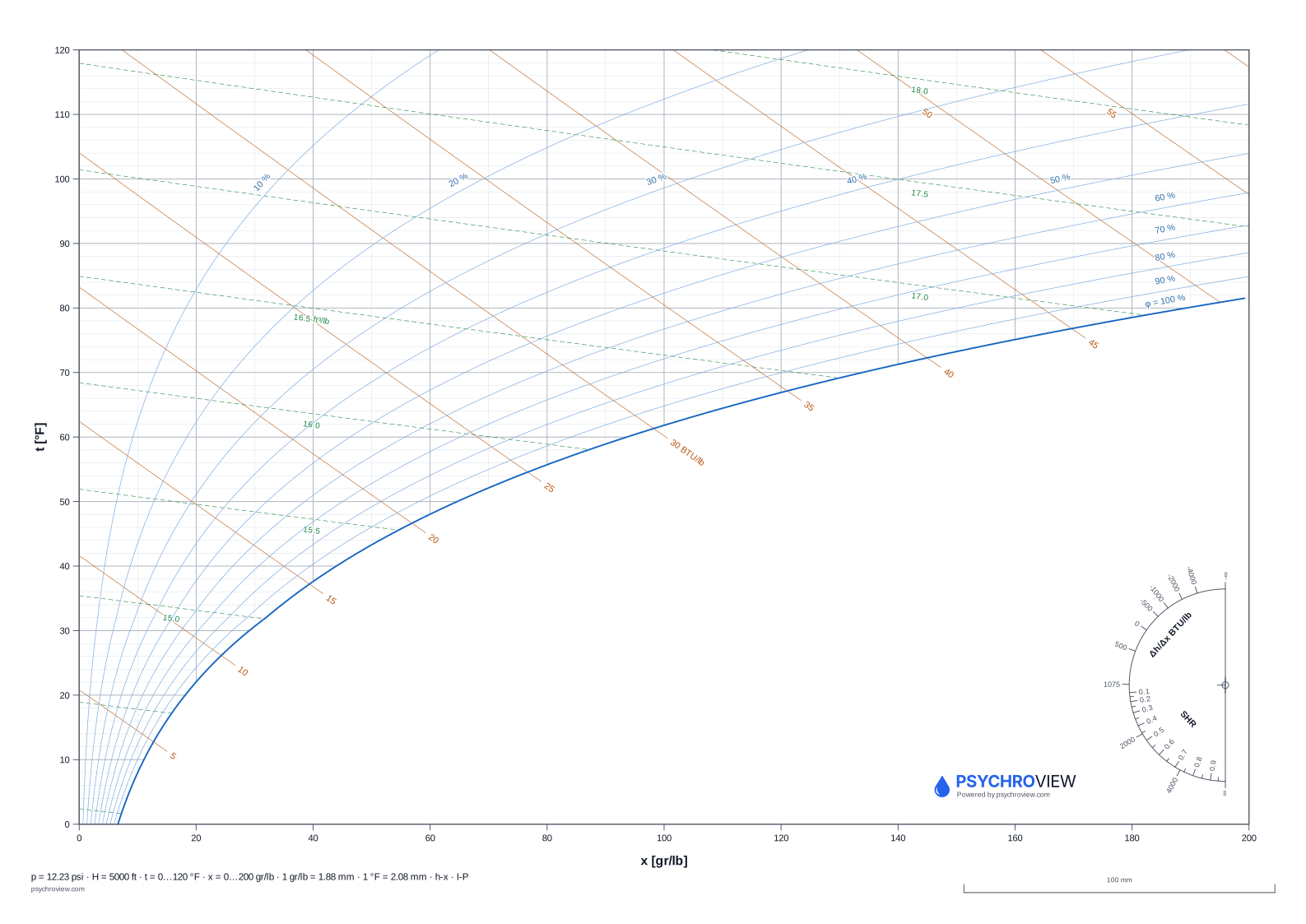
What the two axes are
The h-x chart is named after its two coordinates: enthalpy h and humidity ratio x. Humidity ratio runs along the horizontal axis in grams of water per kilogram of dry air — not per kilogram of the mixture, which is what makes the whole chart work: the dry air is the part that does not change as you humidify or dehumidify.
Enthalpy is the oblique axis. Lines of constant h fall from upper left to lower right, and their labels sit outside the saturation line, in the region no real air can occupy. Dry-bulb temperature is then not an axis in the strict sense: the isotherms are the near-horizontal family that fans out slightly as humidity rises.
Why the enthalpy lines are oblique
Mollier tilted the coordinate system on purpose. If enthalpy were drawn horizontally, the whole usable region of moist air would be squeezed into a narrow wedge and the interesting part of the chart would be unreadable. Skewing the h axis opens that wedge up into the roughly rectangular sheet you are holding.
The practical consequence: an adiabatic process is a straight line parallel to the isenthalps. Adiabatic humidification, evaporative cooling and — to within the accuracy of the drawing — the wet-bulb temperature all follow that direction. A ruler laid parallel to an h line is a valid construction, which is exactly why the line weights on this sheet are absolute in millimetres.
The saturation line and the φ curves
The heaviest line on the sheet, 0.5 mm, is φ = 100 %: the saturation line. Air cannot exist to the other side of it; that region is where the enthalpy labels live, and on most sheets the protractor and the mark as well. Every other curve is clipped against it.
Relative-humidity curves are drawn every 10 %. They are labelled on the curve itself, not in a legend — on paper there is nowhere to look things up. All labels of one family sit on a common isotherm so they read as a row.
Reading the dew point
Dew point is the temperature at which the air would saturate if you cooled it without changing its humidity ratio. On the h-x chart that is a move straight down the x axis — humidity ratio constant — until you hit the saturation line; read the temperature there.
Sheets that do not carry the wet-bulb family have short dew-point ticks set perpendicular to the saturation line, so you do not have to interpolate between isotherms in the crowded corner. Where both families are present the ticks stay but lose their numbers — the wet-bulb labels are already there and the two would overprint.
The protractor: Δh/Δx and SHR
The half-circle in the empty region is the one part of the sheet that depends on the scale of the axes, and it is the reason a chart cannot simply be scaled on a photocopier. It gives the direction of a process, not a point.
Two scales share one arc: ε = Δh/Δx in kJ per kg of water on the outside, SHR (sensible heat ratio) on the inside. Take the value your load calculation gives, find it on the arc, lay a ruler through it and the centre cross, then slide the ruler parallel to itself until it passes through your starting state. That line is the process. ε = 2501 kJ/kg is pure evaporation; the straight edge of the half-circle is ±∞, i.e. purely sensible heating or cooling.
What the footer strip tells you
The stamp is not decoration. It carries the barometric pressure and altitude the sheet was drawn for, the axis ranges, the scale in millimetres per unit, the chart type and the unit system. A psychrometric chart is only valid at one pressure, so a sheet without that number is a sheet you cannot check.
Next to it is the 100 mm control line. Measure it with a ruler after printing. If it is short, the printer scaled the page and the millimetre figures no longer apply — reprint at 100 % with “fit to page” off.
Where paper ends. A blank sheet is the fastest way to check a process with a pencil — and for checking someone else’s calculation often the only sensible one. The moment one input changes, though, the whole chain has to be redrawn. That part is what the application does: the same chart, chained processes, export to PDF and DXF.
Working in CAD?
The same charts are available as DXF with named layers — insert one into your drawing, switch off what gets in the way and draw your process on your own layer.
Psychrometric chart as DXF →Frequently asked questions
What is the difference between a Mollier chart and a psychrometric chart? +
None, physically. The Mollier h-x chart puts humidity ratio on the horizontal axis and enthalpy oblique; the Carrier psychrometric chart puts dry-bulb temperature horizontal and humidity ratio vertical. One is roughly the mirror image of the other. Mollier is the central-European convention, Carrier the ASHRAE one.
Why is my sheet only valid at one pressure? +
Because saturation humidity ratio depends on barometric pressure. The saturation line, and with it every φ curve, moves when the pressure changes. The pressure the sheet was drawn for is printed in the footer strip; pick the altitude closest to your site.
Can I print the h-x chart on A0? +
Yes — send the A3 SVG to the plotter. It carries its size in millimetres, so a plotter or copy shop can scale it to any format without guessing. Line weights stay absolute, so an A0 plot has the same 0.13 mm grid as the A4 print, not four times thicker lines.